

So, it looks like we won’t be boycotting the upcoming 2014 Sochi Olympics. Bummer. But, why would we? With all that gender-segregated, celebration of the different aspects of the human body, the Olympics are already very, very, gay.
So I’ve been thinking, we need to come up with a universally recognized gesture that symbolizes support for LGBT people, in Russia, and around the world. Something that athletes can do at the games if they want to show support for us in a non-verbal way. A “Queer Salute” if you will. Something we can also use once the games are over too.
So, I`m holding a poll on the subject. And, in no particular order, here are some potential choices:
OPTION-A ” LIMP-WRISTED ”
 A new spin on established queer body language. That bent wrist says: “I’m Queer and I’m proud”, the left hand on your chest says that you’re saying it from the heart.
OPTION-B, ” I heart PINK TRIANGLE ”
 Modern, and self-explanatory. A little less outlandish, but also more likely to appeal to our straight allies.
OPTION-C Sign Language for the “G”

A write-in suggestions with a certain flair.
OPTION-D The Japanese gesture
Another stylish write-in option.
OPTION-E The Write-in. You send your sketch or pic, with the title of your pose to: queersalute@gmail.com

So yeah, here’s the poll: ^_^
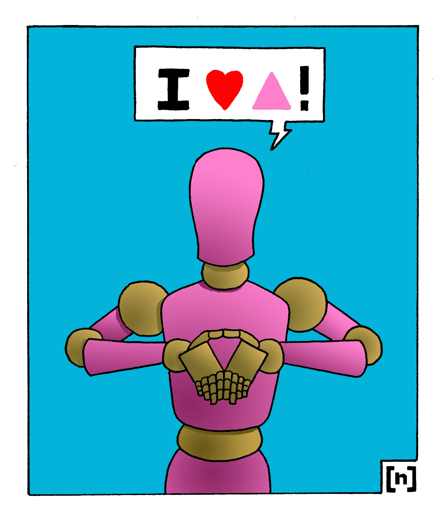
AH! So the option for the “I heart pink triangle” won the vote, and it’s now the official T4D queer salute for the Sochi Olympics! Which is very cool! A lot people suggested doing it with a downward pointing triangle instead, so here is the final updated version of “I heart PINK TRIANGLE”:
[n]
NATNOTE: The models were rendered as art-store mannequins in a vague effort to keep it gender-neutral. :)

![[ POLL ]](https://technology4democracy.com/wp-content/uploads/2012/04/poll.jpg)
![[ EYE NOTICE ]](https://technology4democracy.com/wp-content/uploads/2012/04/eye-notice.jpg?w=150&h=94)
![the CHRONICLES of [ YOU ] 5](https://technology4democracy.com/wp-content/uploads/2013/06/the-chronicles-of-you-5.jpg)
![the 2-PAGE GIANT SIZED CHRONICLES of [ YOU ] pg1](https://technology4democracy.com/wp-content/uploads/2013/06/the-2-page-giant-sized-chronicles-of-you-pg1.jpg)
![the 2-PAGE GIANT-SIZED CHRONICLES of [ YOU ] 5 pg2](https://technology4democracy.com/wp-content/uploads/2013/06/the-2-page-giant-sized-chronicles-of-you-5-pg2.jpg)
![[ YOU ]](https://technology4democracy.com/wp-content/uploads/2013/02/you.jpg?w=150&h=64)

RED versus BLUE
And the people selling us the conflict understand that, they understand the power of color on the subconscious. The opposing political party are so profoundly wrong, they makes us red with anger. That other commercial brand is so lame, it makes us blue in the face. The psychology of color takes on a completely different angle when you apply it to politics and aggressive marketing. The Green party has a green logo. That makes sense. But considering that red is the official color of communists and liberals, then why are the Republicans associated with red?
Turns out it’s just a coincidence. Apparently RED and BLUE were assigned alternatively between Democrats and Republicans each election by the media. But after the controversy of the 2000 George W. Bush election, where each district was fought tooth and nail between a red force and a blue force, well, each color stuck. And that’s how the Republican party ended up with the official color of liberals and communists.
I remember my high school history teacher telling us that back in the day, when Quebec was still ruled like a theological monarchy, that before every election, the clergy would advise their parishioners on how to vote with the following statement: ” Heaven is blue, and Hell is red, makes sure you vote wisely”! That was referring to the socially progressive Liberal party and their red logo, as well as to the church-supporting Union National and their blue logo. There’s nothing like having the catholic church spell it out for us kindergarten educated electoral simpletons, using simple color-coded analogies. And then people wonder why Quebecers curse at the Catholic church so much.
And ultimately, if you look at it, why is it always Red vs Blue? Why not Brown vs Purple? Turquoise vs Canary Yellow? And apart from the fact that those might clash, I would venture to say that the main reason for RED and BLUE to always be picked for rivalries, is because, on average BLUE is always everybody’s favorite color. The sky is blue, the ocean is blue, what’s not to like? And RED is the color that will always “pop out” the most. Unless you put it next to some pink, but then again, pink is just some “light red” if you get down to it.
[n]
NATNOTE : Any similarities to existing brands and their trademarked logos, is a coincidence, unless used specifically for satirical purposes.
Share this:
9 Comments
Posted in ANALYSIS, COMMENTARY, TEXTUALS WITH VISUALS, VS
Tagged COKEvsPEPSI, PLAIDvsPOLKADOTS, REDvsBLUE, REPUBLICANSvsDEMOCRATS, RIGHTvsLEFT